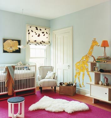
Ok, "design wars" might be a bit melodramatic. However, in almost every relationship there are disagreements, different perspectives, and unique ideas. Designing a space together creates plenty of opportunities for differences of opinion, and renovating a house together really could turn into quite a fight.
Luckily, David and I have very similar aesthetics and work together really well. But from time to time, we just have completely different visions for a space. When picking out a paint color for Dmitri's (and the new baby's) room this weekend, we realized that we had completely different ideas for the theme/style of the room. This is the chronicle of how we worked through our ideas to create a mutually pleasing space that both of us love and that represents each of our unique perspectives. And you'll get to see the play-by-play as we put the room together.
We agreed on a few things from the very beginning: Finding points of agreement is always a great place to start.
1. We want it to be gender neutral. (Especially not knowing the sex of baby # 2).
2. We want it to be aesthetically pleasing to a child, not just adults.
3. We don't want it to be "baby-ish." It's more of a playroom, not just a nursery.
4. We want it to inspire creativity, exploration, and be a fun place for a child to play.
5. We want a modern/funky/playful style.
Yet, how we interpreted these ideas turned out pretty differently. I pictured the room somewhat like this:
via Houzz
But David was imagining something like this (except without the scallop):
via Oh Dee Doh
Pretty different, huh?
Secondly, we articulated what we liked and didn't like about each other's rooms.
David liked:
-The striped chair
-The hot pink rug
-The animal wall-decals
David did not like:
-The light turquoise walls
-And he felt the room was not very "exciting"
Caroline liked:
-The orange rug
-The little table & chairs
Caroline did not like:
-The neutral walls
-The idea of the color pallet without pink (orange & yellow alone seemed "blah" and monochromatic)
We then looked through inspiration photos on sites like Oh Dee Doh and Houzz to find rooms that we both loved.
There was no doubt when we saw this room that we both said, "wow."
We both loved the ideas behind this room. And no wonder, it was put together by an Urban Outfitter's designer for his daughter, with the help of Anthropologie designer friends.
We don't plan to "copy" this room, we definitely will be incorporating a lot of our own ideas. But, that is how we found a style and room to inspire both of us and bring us onto the same design page.
Stay tuned as we work on Dmitri's & Baby # 2's room!


12 comments:
Ohhh those rooms have some great ideas! I'm excited to see what you guys come up with!
I'm at the beginning stages of creating a space for baby #2 too, but first I have to lose my craft room, and that's got a looooot of stuff in it!
What a great way to work out a mutually agreeable design.
Can't wait to see what you end up doing!! LOVE that anthro room and also the giraffe!!
Design negotiations! I've been through a few of those...can't wait to see how your new nursery turns out.
Congrats to you on baby #2!!
Thanks so much for stopping by my blog and your sweet comment on my dressing table! I am loving your too and can't wait to check out more (and see what you do with this nursery)!
:) Christine
This reminds me of that HGTV show (name escapes) about gender differences in design. Congrats on the new baby! That's so exciting - and I can tell no matter the design result, it will still be a cute nursery!
Thanks for visiting Sanity Fair too :)
-SF
hello! new here. i love the name of your blog ;) and this post! i am in my 7th month pregnant with our fourth child, who is a girl named Ever Elizabeth. and i can't get enough baby stuff!!!
Ohhh! LOVE the inspiration you chose together and it was v funny reading through your differences. When you're passionate about design it can get fiesty!
Can't wait to see more!!!
love all your inspiration pictures...wishing you much joy as you prepare for baby #2!!
OOOOOOO!!! That's so cute!!!! I love it!
i really like the white trim around the ceiling in the yellow and orange room...
I'm loving the WOW room! The rug and crib are fantastic!!
Post a Comment